Redesigning Dewey, Clever’s design system
Team: 8 Product Designers & 2 Brand Designers
Duration: Nov 2022 - Present
Focus: Design systems, systems thinking
Overview
I led a team of 8 Product Designers and 2 Brand Designers to redesign Dewey, our design system, and PMd the implementation of those components. This work has unlocked a tremendous amount of efficiency for our design and engineering org. It’s helped achieve visual coherence, sped up designers because there’s less ad-hoc QAing, and has sped up engineers through more confident testing and better documentation. We also now have a single source of truth and unity between figma components and github due to the tool I introduced to the org called Storybook! The following is the story of how I championed this redesign to Dewey 3.0:
Understanding the history of Dewey
2017-2020: Dewey 1.0 and Dewey 2.0
Dewey 1.0 was introduced in 2017, marking the beginning of our design system journey.
Dewey 2.0 components were redesigned and updated but there was no official implementation plan
2021: Adoption and Fragmentation
When I joined Clever, designers began using Dewey 2.0 components but often created one-off solutions for their projects.
Additional new designers joined the team and unknowingly duplicated existing components, as they were not aware of the components already available
Some designers discovered components in individual team codebases rather than in Dewey, leading to inconsistencies.
2022: Expansion and Growing Pains
Clever’s design team grew from 4 to 8 product designers.
Significant issues and frustration with Dewey emerged as a result of the increased team size and existing system limitations.
Problems with Dewey 2.0
1. Multiple one-off versions of the same component
Often, engineers and designers were too stretched thin to update Dewey components, leading them to create one-off versions for specific use cases. These custom components, which cannot be reused across the team, contribute to inconsistencies across our products. For instance, a component used by multiple teams remains unintegrated into Dewey, causing variations and duplications in different codebases.
2. No Unified Source of Truth for Dewey
Dewey lacked a single source of truth, resulting in numerous discrepancies between components in Figma and GitHub repositories. Designers would use a component in figma and the implemented version of their component would look completely different.
3. Lack of Ownership and Systematic Process
Dewey operated on a volunteer basis, leading to its components often being deprioritized in project timelines due to other high-priority tasks. We needed to cultivate a culture that allocated dedicated design time for Dewey. Currently, the heavy project workload for designers makes it difficult for them to focus on Dewey components. When designers do manage to work on Dewey components, they face challenges due to the lack of a defined process or standardized approach for designing components. This lack of structure hampered our ability to build and maintain a robust design system, causing inefficiencies and potential delays in the development process.
4. Challenges for New Designers
New designers often felt overwhelmed by Dewey. The Figma files were disorganized, and many components lacked clear usage guidelines. Updates to components were not well-documented, leaving newcomers unsure about what has changed or what can be modified. Additionally, some components are reused from outdated files or exist only within individual team codebases, making them difficult for new designers to locate and understand.
How I executed on addressing these problems
Completed an audit of our design system
I conducted a comprehensive audit of all 65 Dewey components, comparing the Figma components with those in GitHub. This detailed analysis allowed me to identify and understand the discrepancies for each component. Some components had small visual discrepancies, some had entire variants missing, while others behaved and looked completely different. This helped me develop a perspective on which components needed to be prioritized first in the redesign roadmap and what needed to change about each component.
Established design system principles
I facilitated a workshop with product leadership and our design team to establish guiding principles for our design system. These principles are practical and opinionated standards that direct our decision-making processes.
My goal was to create principles that would ensure consistent decision-making and after extensive discussion, debate, and dot voting, we aligned on the following principles, which we’ve applied in our design decisions for each component and the overall system over the past two years:
Clear – We make it easy to know what things are or do.
Inclusive – We create for all of our users and their contexts.
Efficient – We help users accomplish their goals without unnecessary steps.
Joyful – We create delight in even the most technical tasks.
Introduced efficiency through design tokens
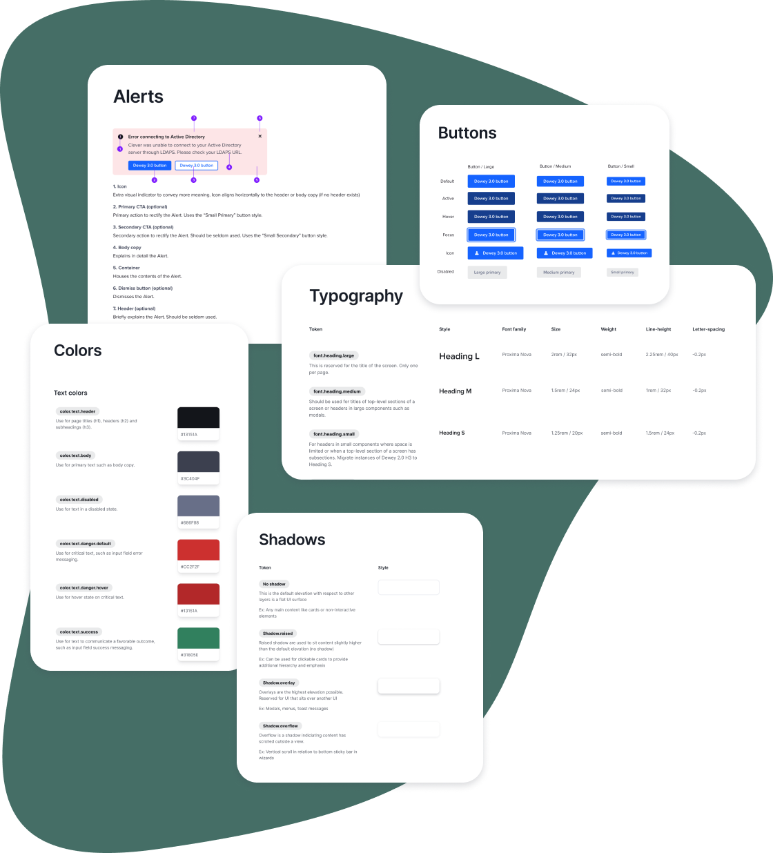
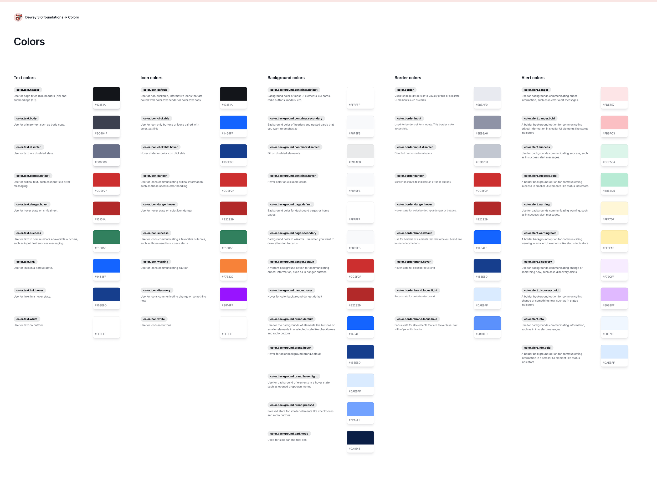
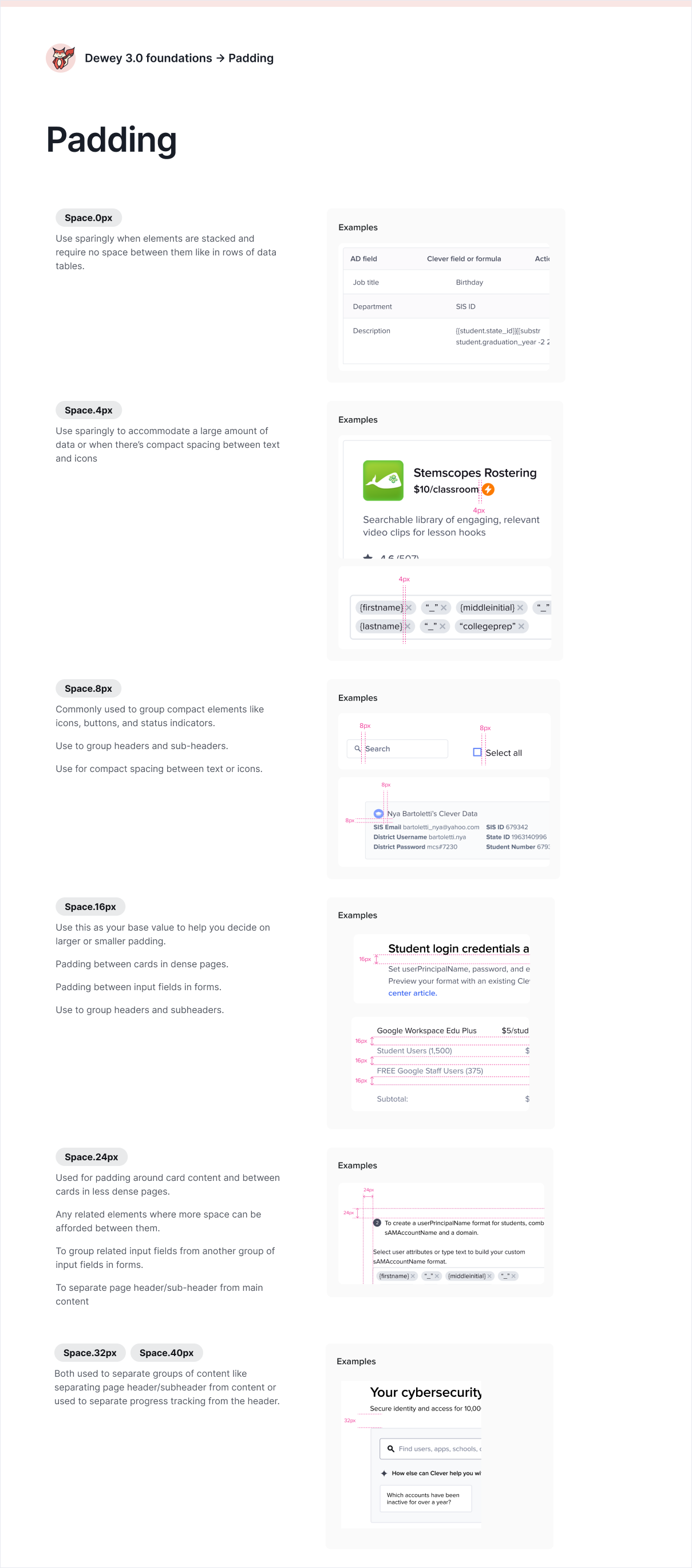
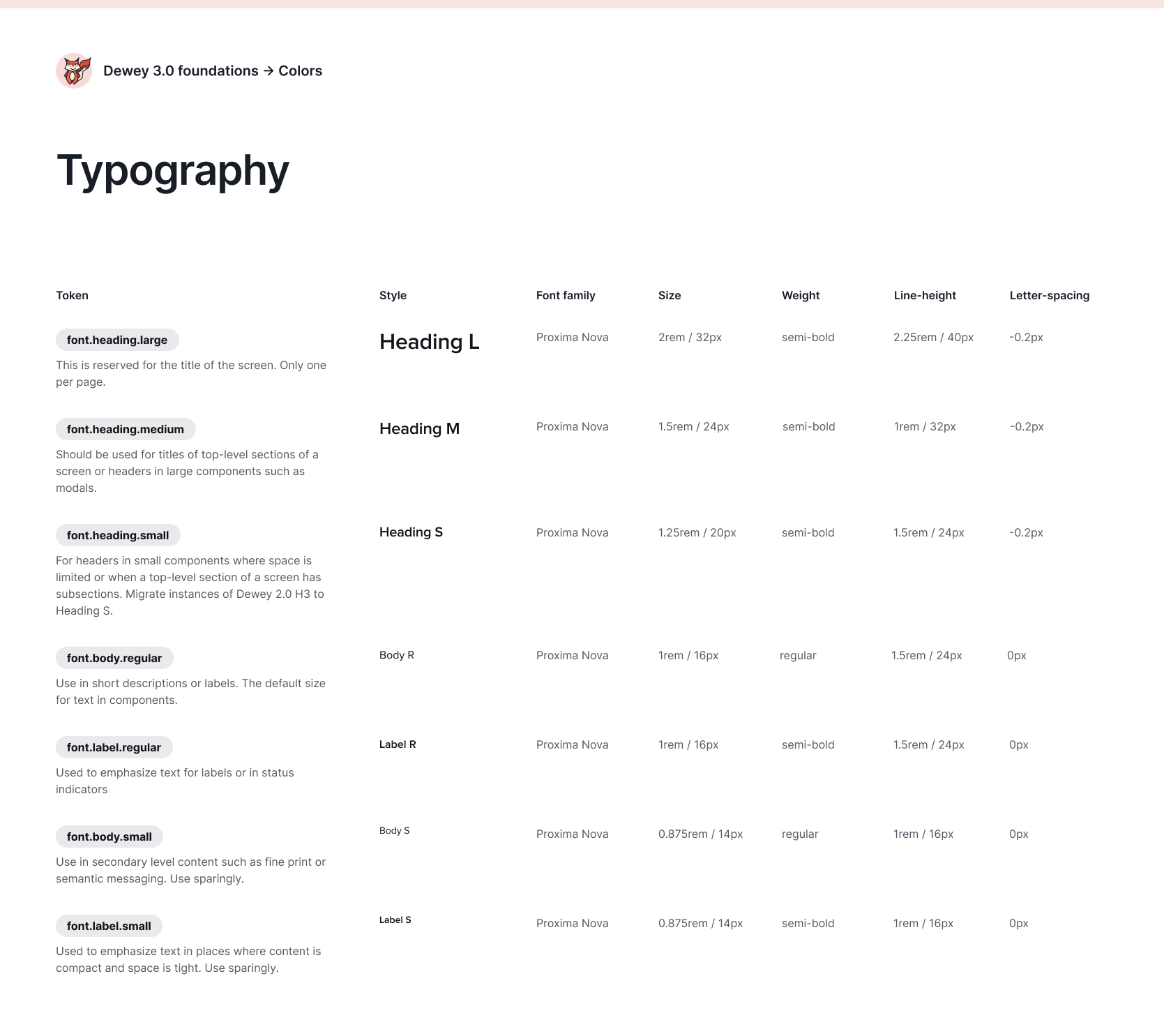
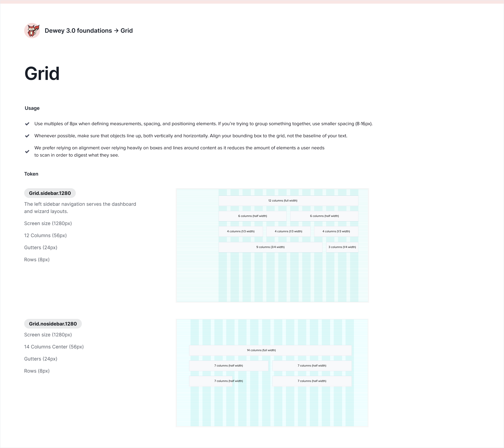
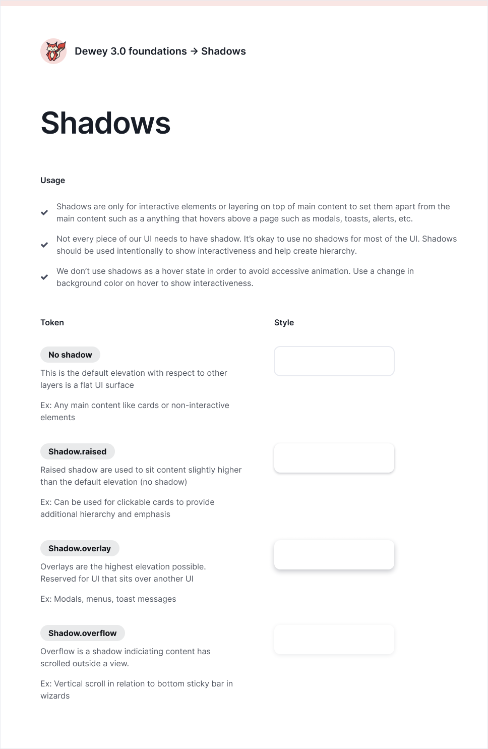
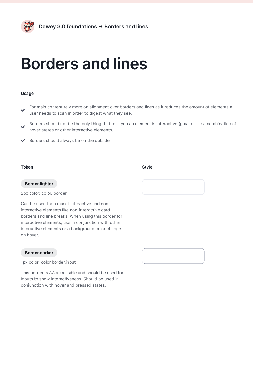
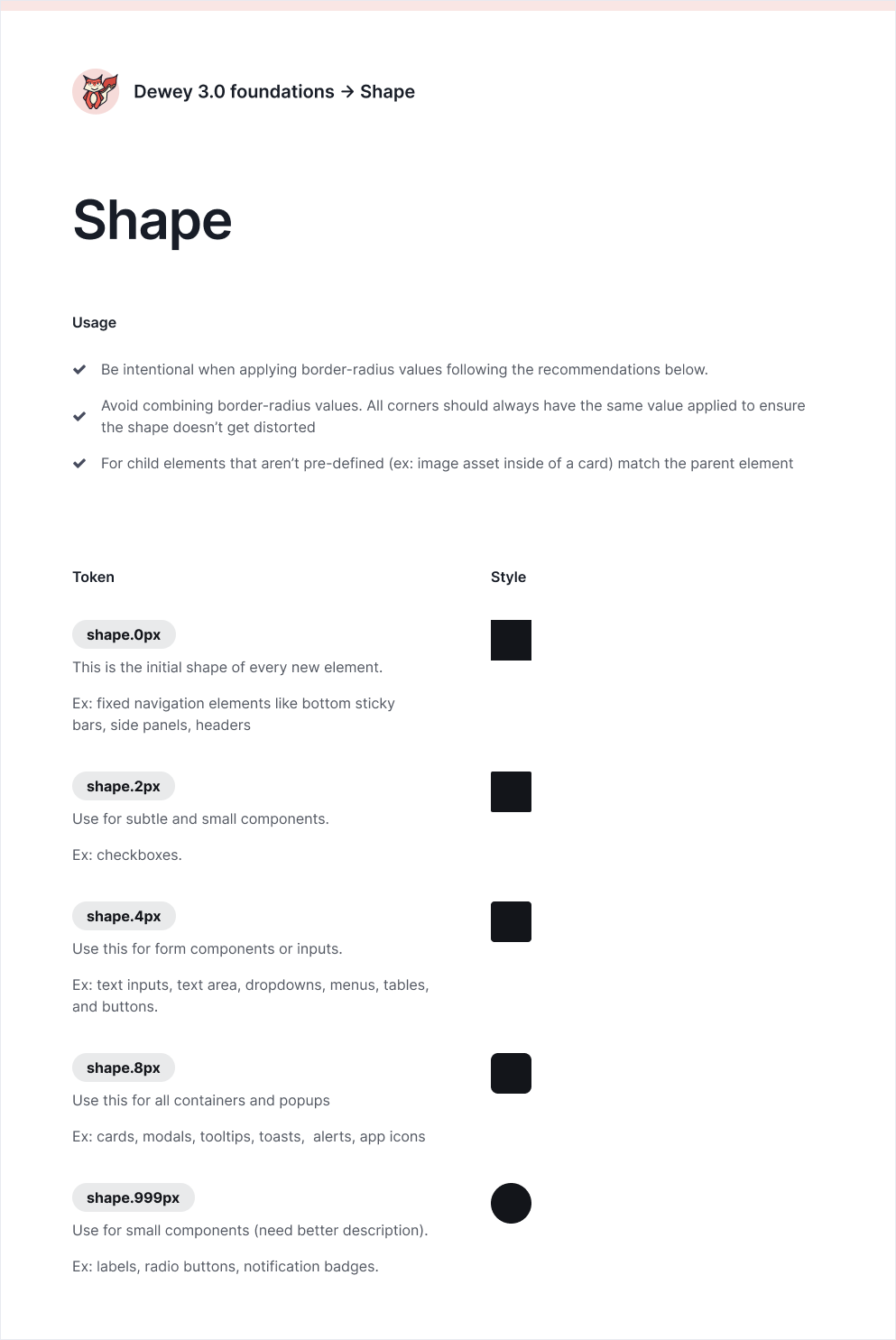
I introduced design tokens to our design system to encapsulate small, repeatable design decisions, such as line thickness, border radius usage, and padding guidelines. This allowed our design team to consistently apply these tokens to all similar usage across products.
The process involved considerable trial and error, as I stress-tested these foundational visual elements across key screens. For instance, I would refine a visual element like border thickness and color, only to realize later that my choices didn’t harmonize well with the shadow tokens I envisioned for the system. It required balancing progress in one area while ensuring that all design decisions worked together cohesively for the system.
Design leadership
Delegating component work and maintaining the integrity of the rules established
As the lead designer for this system, I created a process for every designer to follow when they were adding components to the system that included things like evaluating problems with the component they were redesigning, gathering inspiration, and stress testing with key screens. I fostered a sense of team ownership by delegating component work and involving every designer on the team while also pairing with each designer and facilitating the team to work together more efficiently by establishing feedback loops. I maintained an overarching view of the entire system and made all final decisions on design choices for components. I believe that keeping this a collaborative effort instead of having me redesign every component myself, is ultimately what created a sense of shared ownership over our design system, why it has gotten adopted so well, and what’s helped change the culture of our design system.
Organizing work streams
Over the course of two years, I facilitated three 1 week long on-sites with our whole design team to gradually redesign components and implement the design tokens I developed. As time progressed, the complexity of what we tackled in these on-sites also increased. We started with atomic level components then moved to more complex, molecular components and eventually tackled patterns like error handling that detailed not just how things looked but were really getting into how things worked.
Phase 1 | Dec 2022: Atomic level components that are most heavily used across our system such as buttons, checkboxes, radio buttons, text input, selects, multi-selects, status indicators, alerts, cards, headers, switch
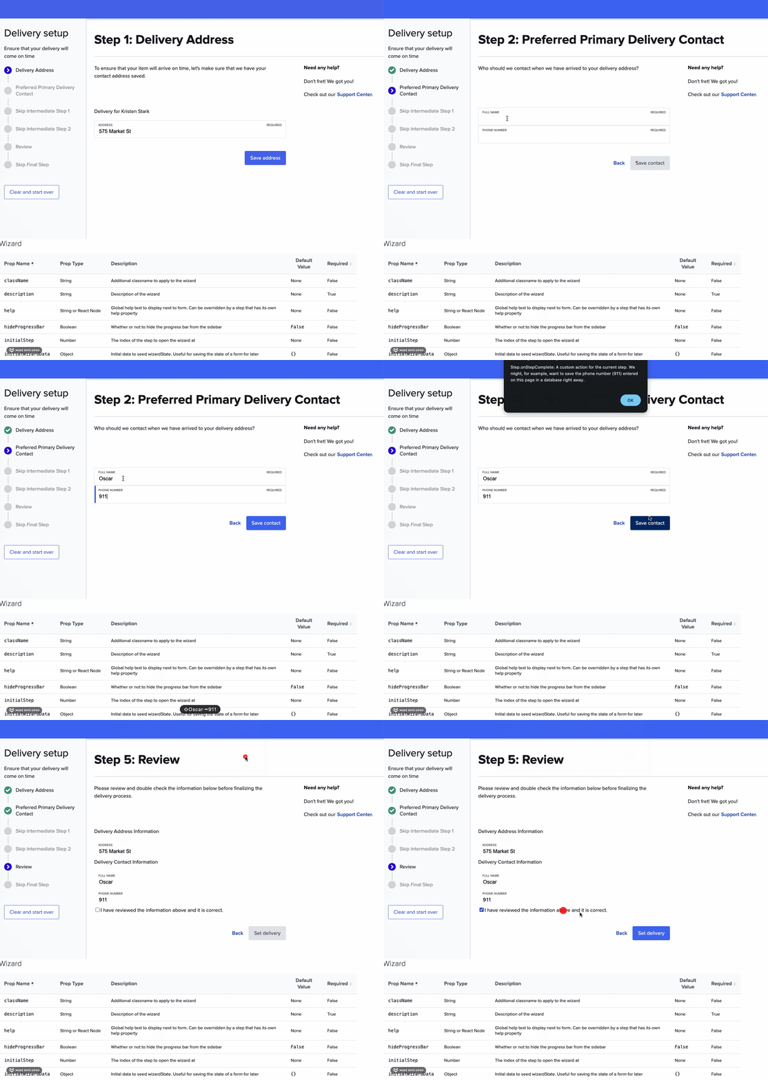
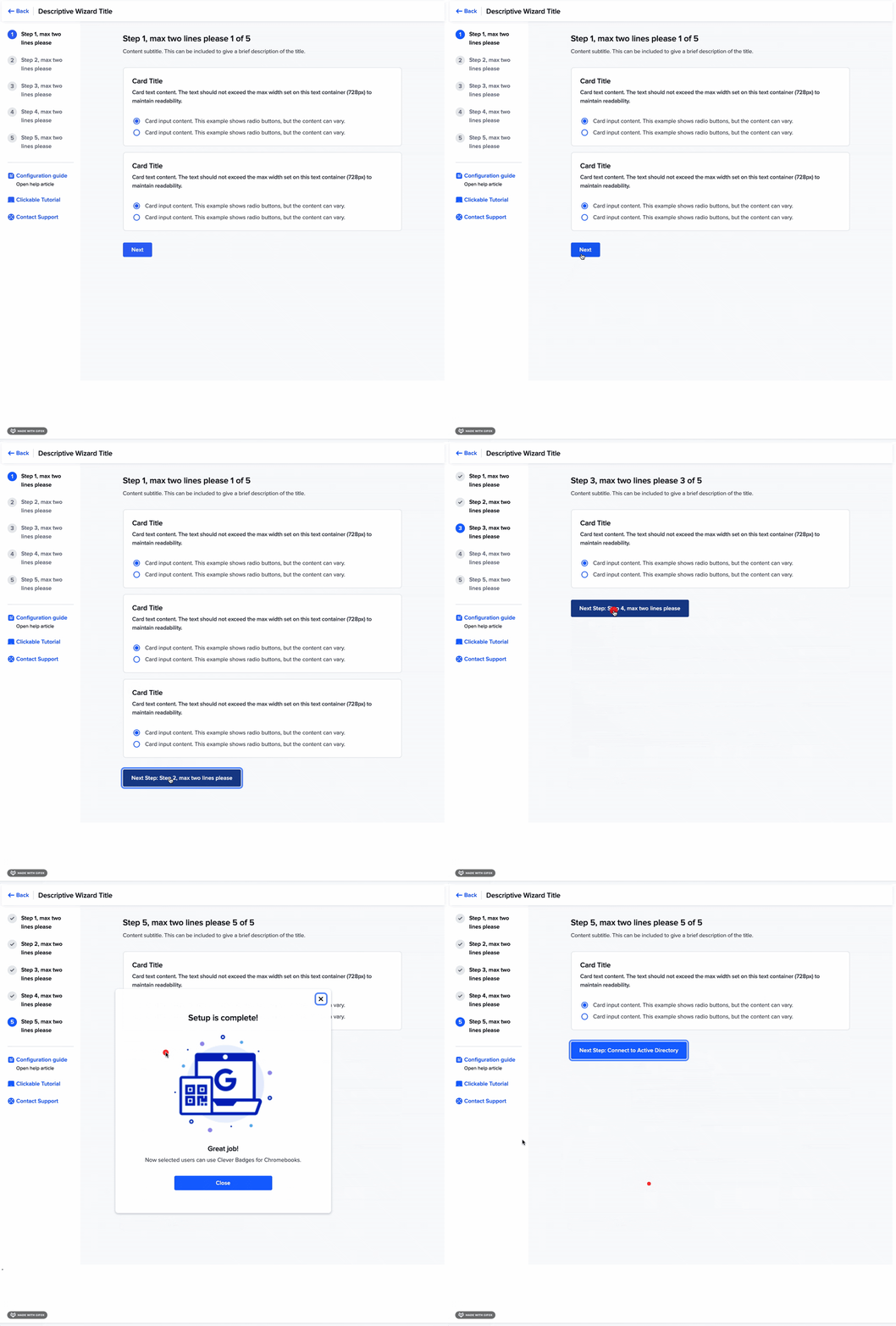
Phase 2 | May 2023: Molecular level components that were high use like a multi-step wizard, file input, tables, modals, filters
Phase 3 | June 2024: Complex molecular level components and variants like complex card patterns, cards with errors, complex filters independent of a table, a processing component
Non-goals: Due to the size of our team and the current state of Dewey, there wasn’t a need for us to tackle Templates and Pages at this point so I didn’t consider this as part of the scope of the redesign.
Between these three phases, I established feedback mechanisms with the design team and front-end leads to understand what needed to be improved about components. I kept a backlog and would slowly chip away at improvements myself, or when I had gathered a large enough amount of work would make the case for another on-site.
Working with eng to implement
Design systems thrive on collaboration between design and engineering, and my partnership with the engineering lead for Dewey was crucial to the successful adoption of Dewey 3.0. Together, we secured buy-in from engineering and product management to have the front-eat lead engineer from each product team rotate onto the Dewey project to build new components and maintain existing ones for Dewey 3.0. I regularly engage with the Dewey engineering lead and all the front-end leads to continuously explore ways to improve the governance of the design system.
Single source of truth
We introduced Storybook to the entire eng and design org as our single source of truth for Dewey components. In the next section you can see some of the newly built components.
Key component changes
File upload
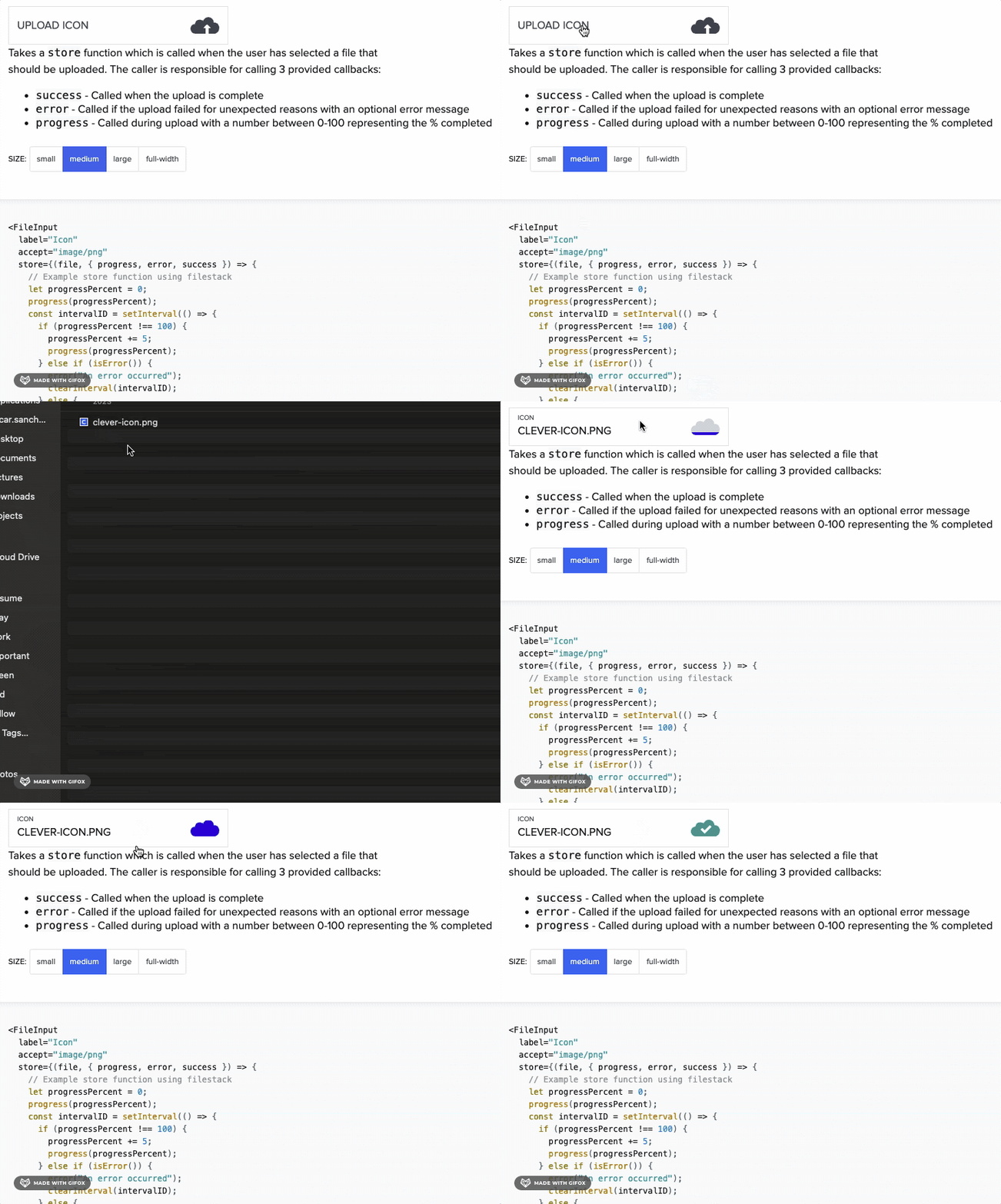
Our file upload component was outdated and broken, with different teams building their own versions over the years. This led to inconsistencies and complications, such as managing upload progress, handling file downloads, deletions, re-uploads, and errors. Given that the component supports large files with up to nine uploads at once, performance and usability were key considerations. We continued to iterate on this and eventually added a progress indicator, allowing users to navigate to other parts of the dashboard while uploads continued.
Before
After
Wizard
[insert description]
Before
After
Learnings
Balancing Consistency with Creativity: While governing the design system, I’ve had to strike a delicate balance between maintaining consistency across products and allowing other designers the freedom to innovate. It's challenging to ensure that design decisions align with the overall system without stifling creativity, but I've learned that clear guidelines and open communication help other designers feel empowered while keeping the system unified.
Ensuring Scalability and Flexibility: Redesigning and now governing the design system has made me more mindful of scalability. As I introduce new components or guidelines, I constantly think about future needs and how flexible the system is for different teams. The key reflection for me has been understanding the importance of setting up structures that can evolve with the product while also staying true to the initial vision.

